
Design exploration, web development and branding

This design exercise was conducted to create a comprehensive brand design for CleanCare, a new eco-friendly laundromat. This all-encompassing project drew on the full breadth of my design expertise. Working closely with their marketing team, I crafted designs that authentically reflected the company’s mission and spirit.
Designing for the Future of Laundry


Logo Exploration
Initially, I explored several iterations of the CleanCare logo using a serif font, but found it too playful for the brand's desired aesthetic.
After selecting Fort as the primary brand font, I chose the bold italic style to give emphasis to the brand name.
The logomark draws from three key inspirations: nature, water cycles, and the laundry process.
Logo versions
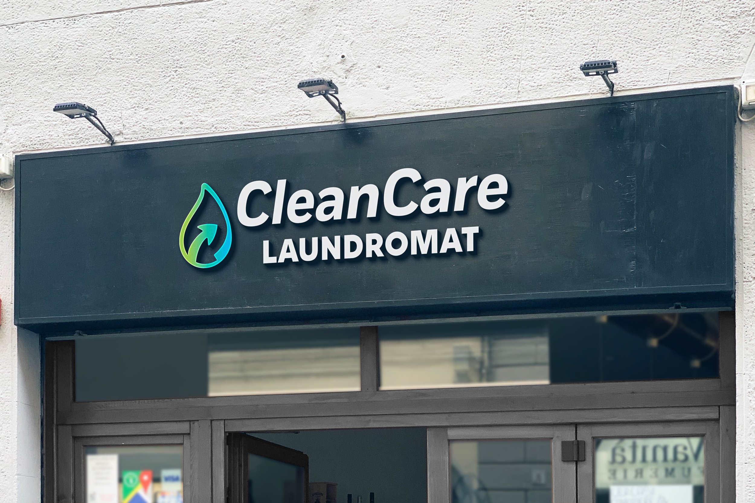
CleanCare Laundromat is committed to providing sustainable and eco-friendly laundry services. This is reflected in a distinctive logo mark.
Designed to symbolize a focus on water conservation, the logomark features an arrow encircling a water droplet, capturing a key moment in the washing process. This design brings CleanCare’s mission of environmental responsibility to life.


Logo - Primary

Logo - Secondary


Logo mark


The CleanCare logo combines the logomark with an italicized brand font that mirrors the arrow’s motion. The word "laundromat" is set in a bold sans serif to highlight the brand's core function.
There are three logo variations for different use cases. The primary logo is used by default. For square or vertical spaces, the secondary logo is used. The logomark itself is reserved for instances where the brand is already clearly established.

CleanCare’s color palette is clean and bright. Vibrant blues and greens call back to this brand’s eco-friendly messaging and overall mission. Gradients can be used to provide depth and contrast in imagery.
Color palette
CleanCare’s design elements include minimal iconography and simple, pill shaped buttonsiconography is made up of illustrations that share two distinct qualities: outlines and rounded edges. This helps with ease of use and scalability across multiple platforms.
Design Elements


Web Design
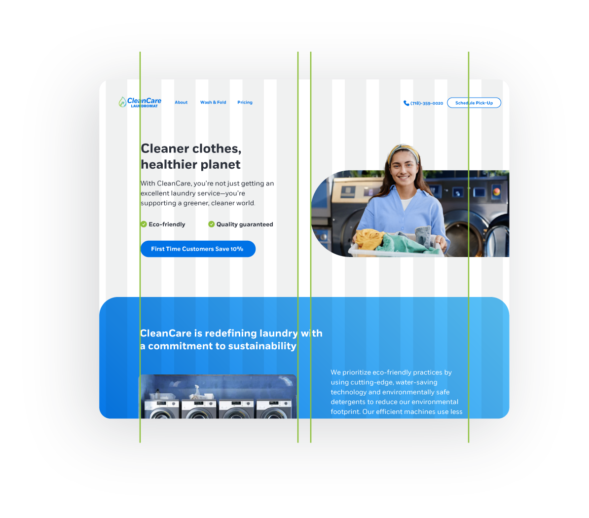
For CleanCare’s homepage, I used a 12-column grid layout in Figma with the following settings: columns 1 and 12 as margins, and content arranged in columns 2-11. The layout can be adapted for various desktop and mobile views.

The project delivered a professional, elevated branding experience for an eco-friendly laundromat. From comprehensive branding touchpoints to engaging visuals, the result would position the laundromat as both recognizable and appealing within its neighborhood.
